Over the last 8 months I’ve learned and been exposed to a vast amount of information at VFS. I’ve taken classes on classical animation, character design, visual storytelling, history of animation, 3D animation, editing, composition, sculpture, team building, creative development, modeling, shading, texturing, rigging, lighting, compositing, life drawing, and acting.
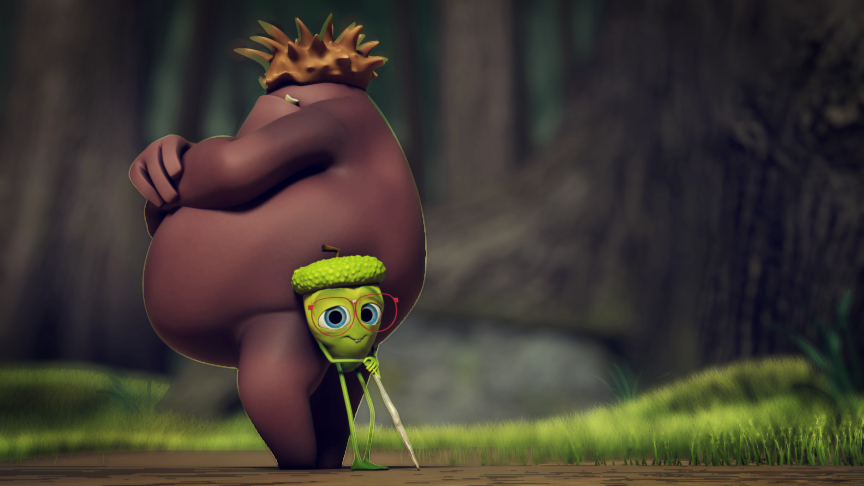
I still have 4 months to go and the task before me is to finish my student film and I thought I’d give a taste of what it may look like and introduce the characters I’ve been working on for the past two months.
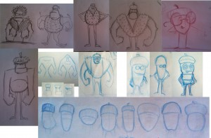
I’ve explored character design to find the most appealing designs for my story, yet still allow the characters to be animatable. I went through dozens of drawings, doodles, and conversations with classmates and mentors and if I had more time I would continue to explore these ideas. But, the production must continue if I’m to finish so I have to get the work to a point that’s good enough and move on.
For character design I really leaned on my mentors Mike, Casey, Craig, Magic, and Caroline and ended up using designs from Mike and Craig for my characters – thanks guys!
For the smaller character I modeled and rigged a character that I ended up hating. I couldn’t imagine enjoying animating this guy and him being my ‘calling card’ on my demo reel. So after a month or so of working on him, I completely scraped his design and revisited the earliest designs I had made with Mike, and with the help of Craig I got a new design.
What does that really mean ‘with the help of Craig?’
Well, here’s what a quick session with him in photoshop looks like during one of our creative development classes. It may seem like a bunch of scribbles, but it made total sense to me as we discussed what would be best for this character. Can you spot the Chicken Little reference?

Once I decided to scrap his design, Craig sat down with me and we took screenshots from Zbrush into photoshop so we could draw right on top of them to quickly get ideas down on how to rebuild him. This is kind of the progression that happened.
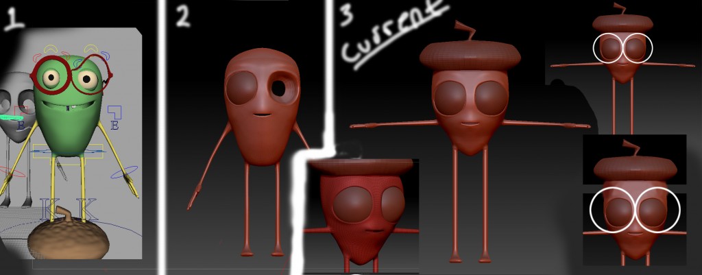
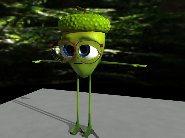
Once we had the idea down, from the previous image, then I had to remodel the character and I gave him more human like topology so he could bend at his waste with better deformations. I also made him fairly heavy geometry so his torso could deform without tearing the geometry. Left, is the original design. Middle, was a slight variation of him, I decided to put his eyes in his head on this one instead of shit outside like in the Left image. Right was the new design, but still exploring some ideas like how big his forehead should be relative to his glasses to leave room for eyebrows.
Obstacles encountered are things like: eyes apart of his head or outside it, eyebrows, glasses, refraction index of lenses, mouth size, position of shoulders, body proportions relative to arms and legs, and as always there’s a huge challenge of taking a flat, 2D drawing and sculpting a 3-dimensional character out of it. I tried to make the glasses be the eyebrows in the first character, that looked weird, then how big should the glasses be so that it wouldn’t block reading the characters emotion, or where should his mouth be placed to not look weird but stay out of the way of the glasses as much as possible? The shoulders carry a lot of emotion, but should they be place above or below where the mouth sits?
Since this a stylized character it created freedom in design as well as obstacles. And each obstacle has to be met with a decision. So there are a lot of decisions and second guessing those decisions, and wishing you had more time to spend on it.
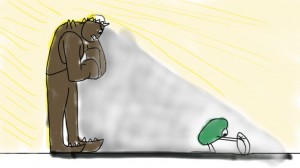
I almost immediately began to envy my classmates who created a story with one character, as everything I have described so far I had to do twice: Does the bully character have eyes at all? Should he have a neck? How big can his jaw be? There will be a lot of low angle shots of him so a big jaw would block seeing the rest of his head, so how big can the jaw be but not obstruct seeing the top of his head from a low camera angle?
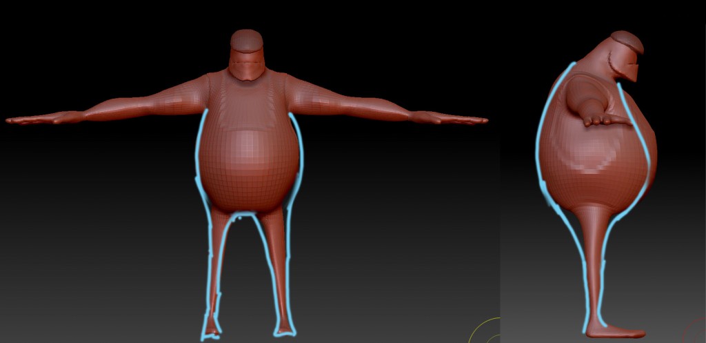
Early version of the bully character that had a neck and more realistic features that didn't mesh well with the other character, so had to go back to the drawing board again . . .
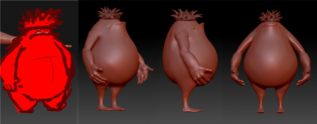
Based off of Craig's drawing I tried to recreate that character in 3D. The hands I modeled were too realistic though so back to modeling.

Now, I'm getting somewhere with this guy. I also decided to cut off his feet, because I thought having feet would be too delicate for his personality as I imagined him stomping around, not rolling from heel to toe as he walked.
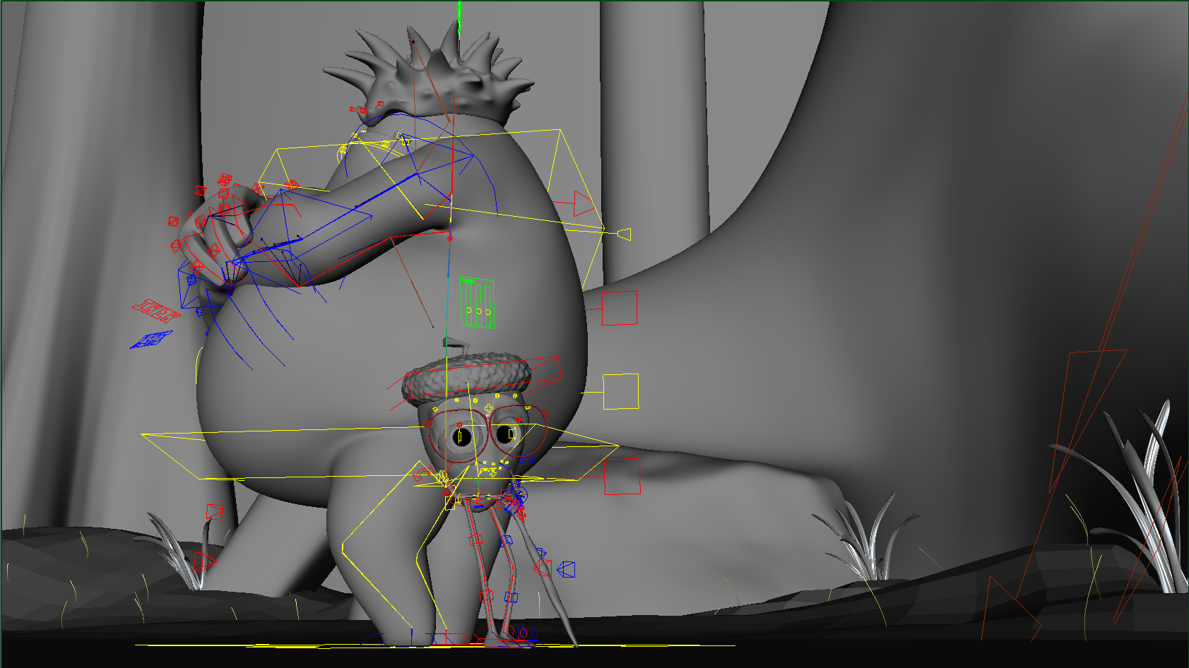
Then there’s rigging and re-rigging, which was a bear. Rigging is essentially creating the bone structure of the character so it takes this statue-like model and turns it into an action figure you can pose for animation.
Rigging is definitely one of those that is an art and a science. I won’t go into it in too much detail, but one good example to understand rigging would be the forearm. When you twist the wrist it can look like a balloon animal being twisted. It doesn’t maintain it’s volume and collapses on itself. So to correct this, you make three influences on the forearm that will follow the rotation of the wrist at 75%, 50%, and 25% (from the wrist to the elbow). That way the forearm will also rotate with the rotation of the wrist. But then there’s gimbal lock to worry about and that’s why I’ll just end there with the rigging stuff.
My point with all this is just to help expose some of what goes into a project like this, as I didn’t really know until I started this one. It’s one thing to see all the credits at the end of a movie, but it’s another thing, for me now, to completely appreciate why each name is up there and how important it is what they contribute to a film.
I think it was on the Wall-E special features that they said if one person were to try and create that film, it would have taken them over 400 years and I believe it.
There have also been a lot of story struggles.
The challenge is to create something with story, yet have it be tailored as an animation piece for the recruiters. Because, truth be told, they don’t really care about story at all as long as it’s not really creepy and violent or something that makes you look like a psychopath. They look for the mechanics and fundamentals of animation because that’s what they are, hopefully, going to be hiring you to do.
They’re also looking for quality, not quantity. A Disney supervising animator told us they don’t watch anything longer than 2 minutes. Ideally you want something done in about 40 seconds.
So in 40 seconds you have to accomplish quite a lot if you also want a story. With these restrictions it’s incredibly important to have everything be staged clearly. Because of this, I’ve had to bail on my original idea to a degree and tailor my short more for animation and less for story.

Here's an idea I spent days on how to make this pamphlet read clearly by drawing different iterations, only to completely cut it from the film because the story was too much for the short amount of time.
All of this was done at the same time as taking an acting class, as well as, an advanced animation class where I made this. The same will be true for the next two months as I begin to animate my short film, I’ll also be in an acting class and creating another animation for advanced animation class.
As I mentioned I would have enjoyed to have spent another year, just developing these characters and the environment and making the rigs better, but if I’m to get this thing done, I have to move on and begin animating which I’m really looking forward to it.
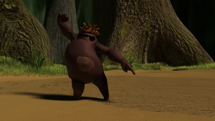
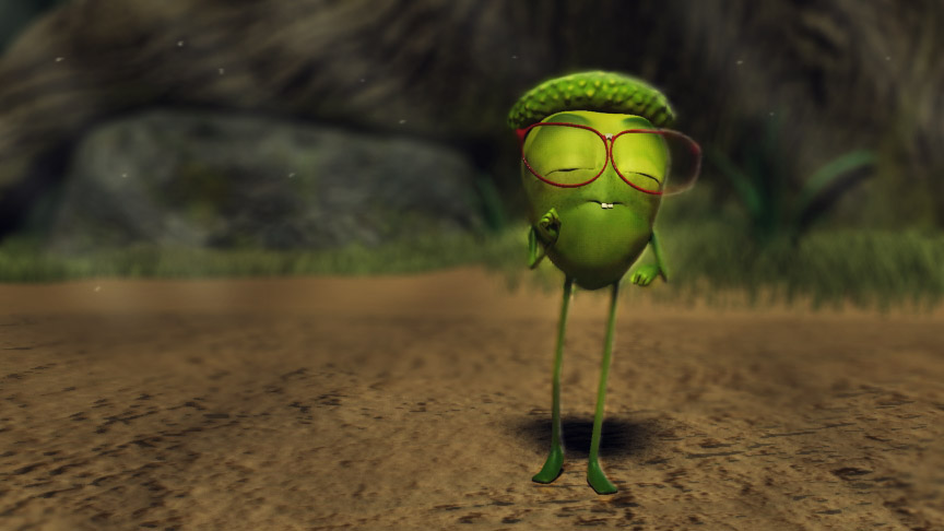
This is from an animation test I did to see if all this stuff I had been working on actually did work.
Thanks for visiting. Hopefully you will be able to watch the full film this January. It will probably be about a minute in length with a twist at the end. The tentative title is: Growing Up.


you are soooo talented….. everyone can relate to these characters, well maybe, except for those playing the role of ‘Buck’ in real life 🙂
love you….. see ya next week